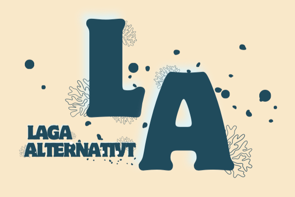
Lagaalternativt
LAGA ALTERNATIVT
Industry: Food Content Creation / UGC / Brand partnerships
Location: Sweden (digital - first brand
Duration: June – November (2025)
Website:https://www.lagaalternativt.com/
Project Overview
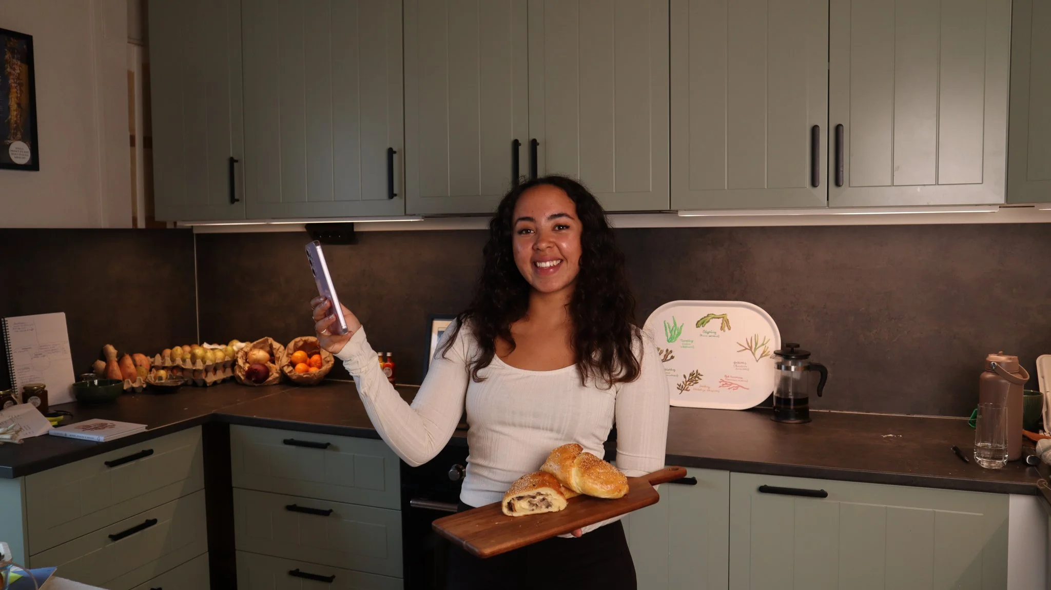
Lagaalternativt is a food-focused creative brand led by Alexandra Apelsten, combining content creation, UGC and brand collaborations within the Scandinavian food industry.
The project involved developing a complete visual identity and a fully redesigned website that captures the brand’s warm, creative and ingredient-driven personality.
AssiDesign crafted a visual system inspired by the ocean, nature and everyday cooking — supported by a fresh, modern palette and expressive typography.
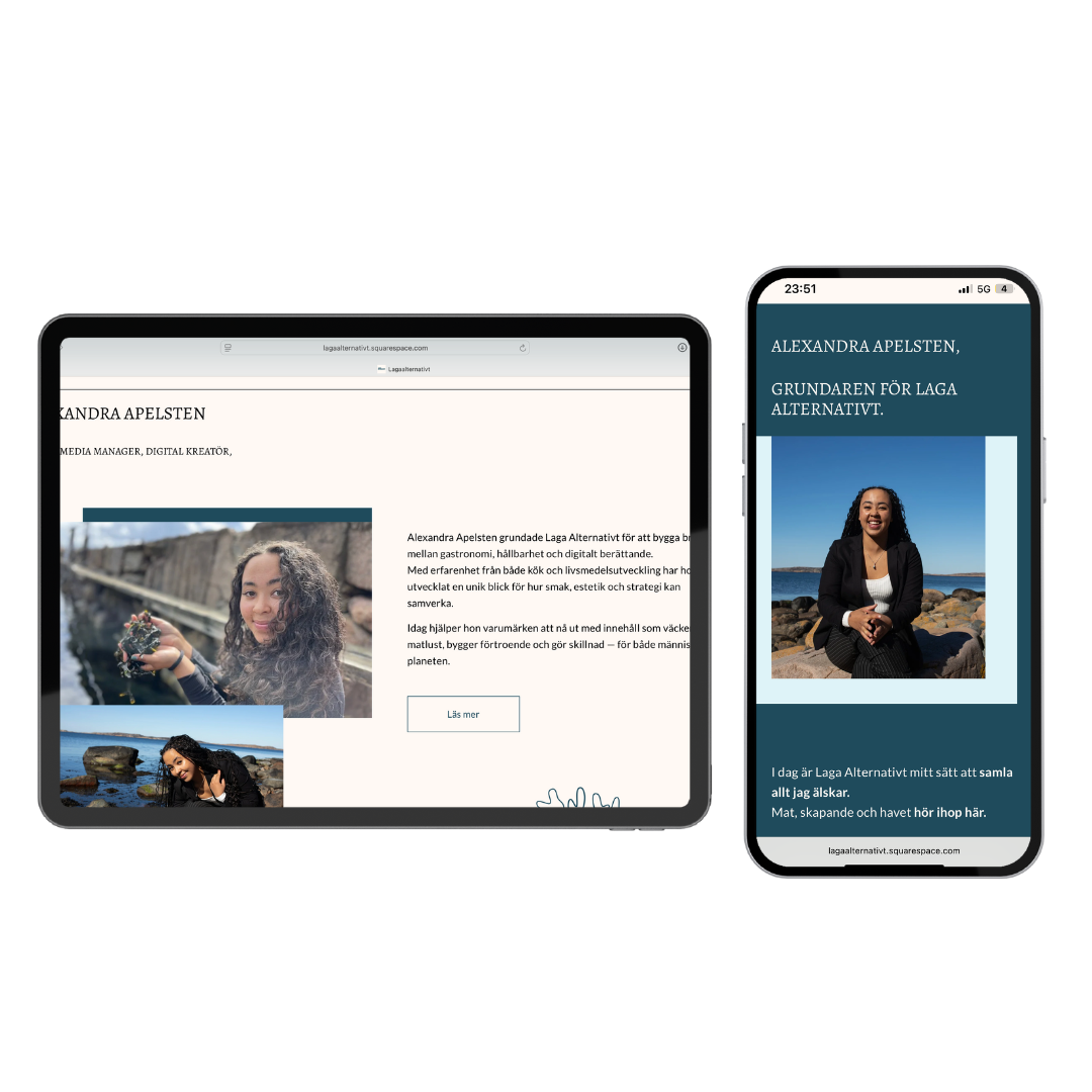
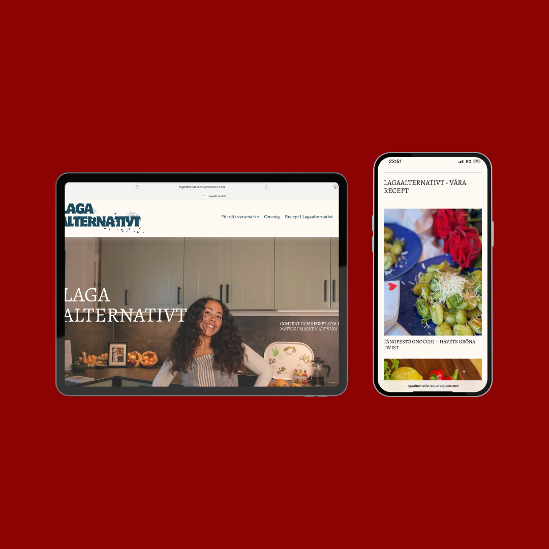
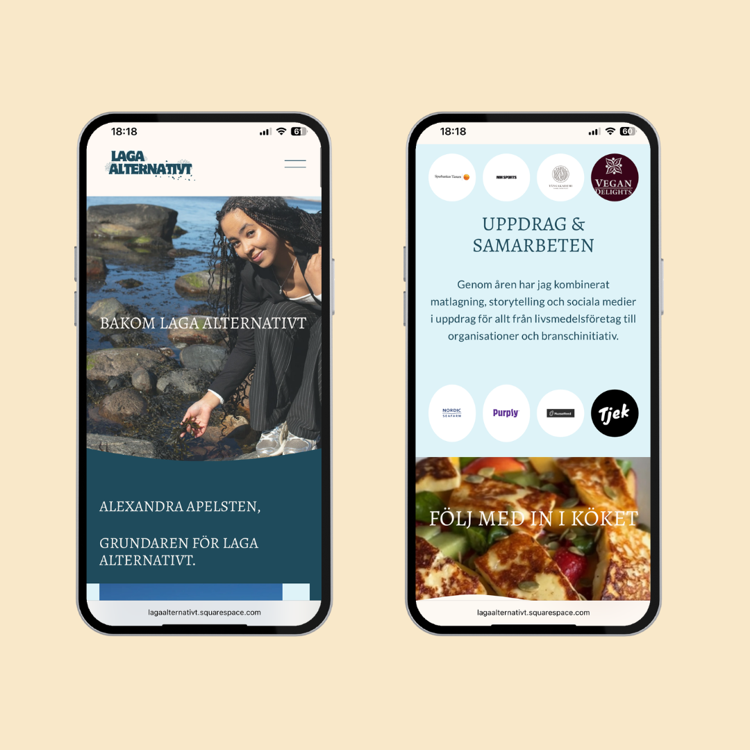
This identity was implemented across a new Squarespace website featuring clear structure, intuitive navigation and a cohesive communication style aligned with Alexandra’s voice.
The result is a recognisable digital presence that supports both sides of the brand: services for food companies and creative collaborations through Alexandra’s own channels.
Challenge
Lagaalternativt needed a cohesive brand identity that could unify two sides of the business: food-focused content creation for companies, and creative collaborations through Alexandra’s own channels.
The existing expression lacked consistency and did not fully capture the warmth, personality and clarity that define the brand.
There was also a need for a website that could communicate these offerings in a clear structure while supporting growth, partnerships and storytelling.
Approach
AssiDesign created a visual identity inspired by the ocean, natural tones and everyday cooking. Color palette, typography and logo system were developed to give the brand a warm and recognisable expression.
The identity was then implemented in a redesigned Squarespace website with intuitive navigation, organised content and a communication style that reflects Alexandra’s voice.
The focus was on simplicity, clarity and a visual world that feels true to Lagaalternativt’s purpose.
iPhone 14 version
Design Direction
The design direction for Lagaalternativt is grounded in a warm and natural visual world inspired by the ocean, fresh ingredients and everyday cooking.
The palette blends deep blue, soft lavender and light tones to create a calm but expressive identity. Typography combines personality with clarity, giving the brand a friendly and confident tone.
The direction emphasises simplicity, warmth and an authentic connection to food. Every visual element supports Alexandra’s storytelling, making the brand feel approachable, modern and true to its purpose.
Outcome and Impact
The project gave Lagaalternativt a sharper identity that mirrors Alexandra’s creativity and her connection to food.
The visual expression now feels clearer, more intentional and easier to recognise across channels.
The website ties her work together in a way that feels natural and effortless.
Services, recipes and collaborations are organised so visitors immediately understand what the brand offers and how they can engage with it.
The design supports the content instead of competing with it, giving Alexandra’s voice and imagery the space they deserve.
The impact is a brand that communicates with more clarity and confidence. Lagaalternativt now appears more established, more professional and more aligned with its purpose.
The updated identity helps the brand attract the right partners, reach new audiences and build stronger relationships.
Overall, the project has created momentum — a visual and digital presence that strengthens trust, lifts the brand’s profile and opens the door to future opportunities.